Zero-K is a Free RTS Game
Free and Open Source (FOSS)
-
Completely Free to Play (F2P) - not a single gameplay element can be unlocked through payment. [more info]
-
Source code open to public, that means you can look up any game mechanic and resource in the freely available game files.
-
Windows, Linux and partial OS X support - head to the download page and grab what you want!
Realtime Strategy (RTS)
- Powerful Interface

- Natural Balance allows units to depend on their natural characteristics and the benefits of the physically simulated environment.
- Multiplayer and Singleplayer gameplay. You can play 1v1, 2v2, even 10v10 and larger games. Free-for-all, PvE or custom missions.
- Epic Scale: From tiny flea-bots to huge mechs and gigantic superweapons wreaking havoc - hundreds or thousands of units on the battlefield, easily viewable with a fully pannable and zoomable camera.
- Streamlined Economy: complex without being tedious, with a simple interface and controls. Resource output can be scaled up as the game progresses, creating increasingly intense battles. The system is designed to allow skilled players to make comebacks from losing positions.
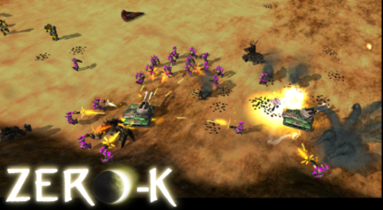
Tons of Features
Tons of Features (psst, watch the Gameplay Features Trailer)
-
Terraform the landscape: raise walls, dig ditches, build ramps and more to provide yourself with an extra tactical advantage.
-
Realistic Physics mean each shot is physically simulated realtime - you can actually evade bullets if you micro-manage your units! Hills and terrain affect line of sight and radar coverage, and explosions deform the terrain.
-
Unique Abilities make sure units are fun to use. From jump-jets, gravity turrets, mobile shields, burning napalm, air drops, Commander morphs, EMP, minelayers, burrowers, replicators, and teleporters - we've got it all and more!
-
Planet Wars lets you take control of your own planet and fight for survival in an ongoing online campaign.
*Some of the many units to try out include:*
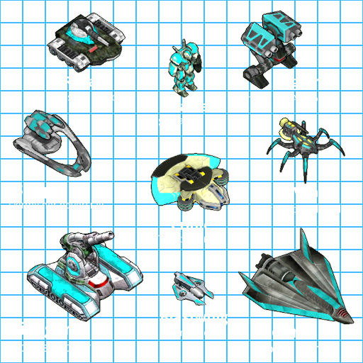
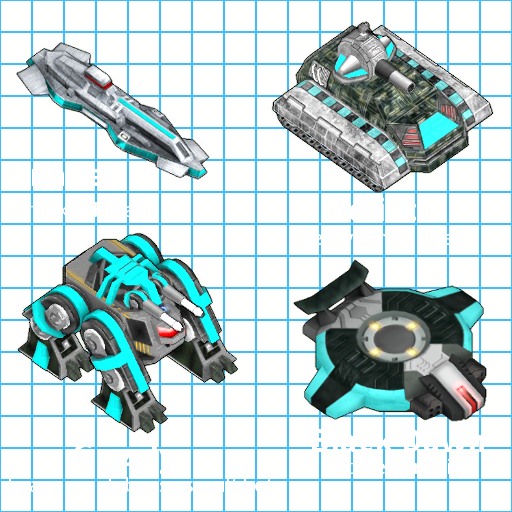
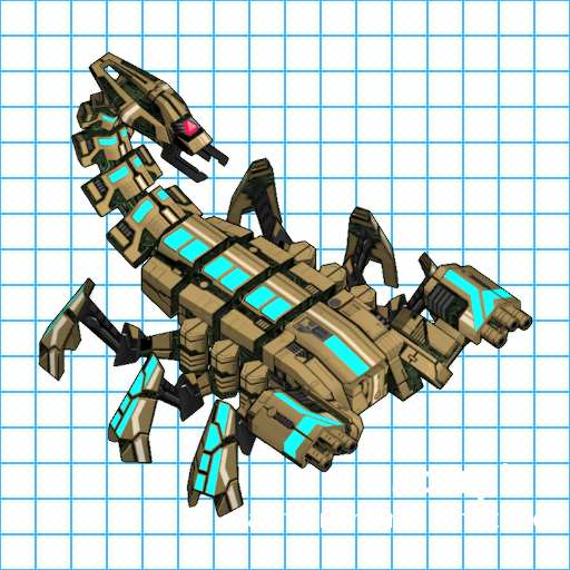
There is much more to discover, but listing all of it is not as fun as finding and trying them out yourself so visit the Downloads page!
Zero-K is made by the players, for the players. All game developers are active and experienced players. Balance and fun are assured.
view edit history
+4 / -0
|
|
Skasi
Edits: 27
First: 10 years ago
Last: 10 years ago
|
|
|
This is a draft for a new, updated version of http://zero-k.info/Wiki/FeaturesGoals are a better, cleaner list for new players and better formatting to improve the website's ranking on search engine results (eg. when searching google for "free rts" or "realtime strategy open source" or "linux game" or whatever comes to mind). To reach these goals there are different things that can be done, one of them is this: Google looks at text inside header elements and whether it goes together with what a user might be searching. an example for an existing header: quote:
=== Some of the more prominent features: === |
This is not useful for ZK's ranking. A user will not visit google and type "prominent features" when looking for an RTS game. another example: quote:
=== Welcome to Zero-K === |
This is not very useful either. A user who looks for a new cool multiplayer game has no idea that "Zero-K" exists so they will never type "Zero-K" into google. Potential players are very likely to search for "free rts", "linux rts" and similar, so we'll have to try getting such things covered.
+4 / -0
|
Roll up, Roll up! all the fun of the fair!. 2 Coconut shells for a dollar, knock the mermaid off the shelf and win a prize to see the hairy lady! Roll up, roll up.
+0 / -0
|
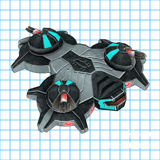
I dislike the "unit showcase". It's super huge but conveys no information whatsoever. Like there's this thing that looks like a CD tray and it says "skirmisher hovercraft" and nothing else, how am I supposed to know how fun the unit is? There's not even a background or anything, just a picture in the void. Compare to the screenshot above: you are shown how you can outmaneuver and swarm a tank with these cool machinegun bots, with misc gameplay stuff like debris and explosions also shown. Meanwhile the bot's unit showcase just shows a dull picture and some non-descriptive text.
+2 / -0
|
I've added a TL;DR for lulz. Do we want a TL;DR? It probably doesn't help with search engine ranking and doesn't really get players to play the game, so we can just remove it. Thoughts?     Sprung Sprung, I didn't really want to remove anything. Of course we can probably make it more interesting - I've already had plans for epic mouseover interactions with the unit examples: a .gif showing the unit in action and a weapon/item description when moving over pieces of the model. That was part of my old large complete overhaul of the landing page. This here is just supposed to be a quick and easy/simple fix with a hopefully high return of investment. The current version of unit example is not really derogatory or deterring though, is it? I just noticed the front page could also use some better widescreen support. We can fit MUCH more shiny things in the "very-first-impression" area so visitors don't need to scroll down. Then YT video could float on the right side of the first list and the glaive+reaper img on the left side of the second list. Like so:  In the default view only 70% of the width is available.
+1 / -0
|
You forgot something. 
+6 / -0
|
Nah, that's something for my next project    Stuart98 Stuart98.. Any actual feedback? :)
+8 / -0
|
It's not deterrent in theory but my experience with games who show off "coolness" is that they do so because gameplay is utter shit.
+0 / -0
|
Proof of concept for fancy unit display.(code backup) [Spoiler]SVG <svg height="512" width="512">
<g>
<polygon points="120, 250,
75, 180,
60, 125,
81, 55,
98, 45,
155, 75,
200, 140,
180, 160,
125, 120,
185, 190,
145, 210" />
<text x="160" y="20">Lightning Tail
<tspan x="180" y="45">Surprise your enemies with a</tspan>
<tspan x="180" y="63">high powered electro magnetic</tspan>
<tspan x="180" y="81">lightning sting.</tspan>
<tspan x="200" y="101">Enough to quickly disable even</tspan>
<tspan x="200" y="119">a tougher opponent.</tspan>
</text>
</g>
<g>
<polygon points="378, 240,
423, 235,
489, 281,
439, 322,
378, 278" />
<polygon points="225, 350,
270, 345,
336, 391,
283, 434,
225, 390" />
<text x="265" y="100">Frontal Particle Cannons
<tspan x="295" y="125">After an enemy has been</tspan>
<tspan x="295" y="143">disabled by the tail there</tspan>
<tspan x="295" y="161">is not much chance for them</tspan>
<tspan x="295" y="179">to escape these particle</tspan>
<tspan x="295" y="197">accelerators.</tspan>
<tspan x="365" y="217">Pew pew pew.</tspan>
</text>
</g>
<g>
<polygon points="245, 195,
315, 240,
315, 265,
215, 340,
145, 295,
145, 270" />
<text x="230" y="80">Cloaking device
<tspan x="230" y="105">A very distinctive feature,</tspan>
<tspan x="230" y="123">this high tech cloaking device</tspan>
<tspan x="230" y="141">is strong enough to hide even</tspan>
<tspan x="230" y="159">the massive Scorpion strider</tspan>
<tspan x="230" y="177">from enemy sensors.</tspan>
<tspan x="278" y="193" class="small">(Provided you don't</tspan>
<tspan x="283" y="207" class="small">run out of energy.)</tspan>
</text>
</g>
<g>
<circle cx="75" cy="300" r="30" />
<circle cx="130" cy="370" r="30" />
<circle cx="200" cy="420" r="30" />
<!--<circle cx="230" cy="170" r="25" />
<circle cx="335" cy="230" r="25" />-->
<text x="5" y="375">Legs
<tspan x="5" y="400">Three all-</tspan>
<tspan x="5" y="418">terrain legs</tspan>
<tspan x="5" y="436">on both sides allow</tspan>
<tspan x="5" y="454">the Scorpion to</tspan>
<tspan x="5" y="472">reach almost any</tspan>
<tspan x="5" y="490">target with ease.</tspan>
</text>
</g>
</svg>
CSS html {
background-color: #000;
}
svg {
background: url('http://licho.eu/alba/Zero-K/showcase_big_1.png') no-repeat scroll left top;
}
text {
display: none;
fill: #fff;
text-shadow: 1px 1px 2px #000,
-1px 1px 2px #000,
1px -1px 2px #000,
-1px -1px 2px #000;
font-size: 22px;
}
tspan {
font-size: 16px;
}
tspan.small {
font-size: 12px;
}
g:hover text {
display: block;
}
polygon, circle {
fill: rgba(0, 255, 255, 0);
stroke: rgba(255, 255, 255, 0.4);
stroke-width: 3;
transition: fill 1.5s;
}
g:hover polygon, g:hover circle {
fill: rgba(0, 255, 255, 0.33);
stroke: rgba(0, 255, 255, 0.5);
stroke-width: 4;
cursor: help;
}
+3 / -0
|
This looks like a good improvement. Some old, bad, terms are still in the dot points though. "Special damages" is a technical term. Perhaps rework that sentence around the phrase "armour types" and mention that the lack of communication of most armour systems is the problem. "Resourced are unlimited" should be removed because I think it is either a feature people will think is bad (ie, they are confused into thinking that resource gathering is unimportant/not a thing) or will not care about. Games with finite resources rarely exhaust the map so I don't think this is something many people consider. Just say the end result of the economy system, not details about how we achieve that result. That is a good general rule for this type of page.
+1 / -0
|
use all the cool webms of skuttles imho. that looks cool to someone who has no idea what's going on  http://gfycat.com/FabulousCreepyDikkops http://gfycat.com/FabulousCreepyDikkopsmay or may not explode browser [Spoiler]
+2 / -0
|
  dorsh dorsh this was me trying to skittle some neb, but @Rafal[ZK] was smart enough to get skittled too with his "lobster trainer" dgun com :P
+0 / -0
|
|
|
Skasi , add "Nuclear mushroom" as a header, and under it just a gif on nuke shiny... And maybe Singu shiny.. and.. skuttle shiny.. and .. rmroe shinys.. anyway, people love searchign for word ''nuclear''
+0 / -0
|
quote:
anyway, people love searchign for word ''nuclear'' |
Is that serious? :O
+0 / -0
|
i don't think the mpeg containers in the spoiler tag after that load until you start them, though that gif is a beauty it would suck to lose
+0 / -0
|
New concept for the placement of objects (ignore missing makeup, local copy): Sadly I can't put the code into the wiki like this cause it's mostly "lower level" HTML/CSS changes, so it's not visible at the top of this page. Whether elements float left/right is still pretty much open, but the top/bottom order of elements makes sense like that I guess. Without scrolling down everything up to and including the "Realtime Strategy (RTS)" list should be visible on modern resolutions. 
+3 / -0
|
You can use the actual Features page on the test site to see how things will look.
+0 / -0
|


