Loading...
  OR  Zero-K Name:    Password:   
Back to List

Fractured_Faces Supported

By Oxirane
Rating:

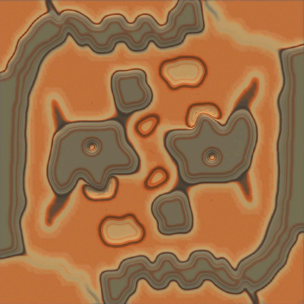
Fractured Faces by Oxirane
Size: 16 x 16

PLAY ON THIS MAP


Downloads: 889
Manual downloads:
http://api.springfiles.com/files/maps/fractured_faces.sd7
http://zero-k.info/content/maps/Fractured_Faces.sd7
http://spring1.admin-box.com/downloads/spring/spring-maps/Fractured_Faces.sd7


Preview
Filter:    Player:  
Page of 2 (28 records)
sort
12 years ago
Could be interesting not sure a bit bland.
+0 / -0
9 years ago
We have Gods of War Remake then why not have this featured?
+0 / -0


9 years ago
Fair point. I'll get rid of GoW.
+4 / -0
FIrankFFC
9 years ago
yes, its ugly anyway
+1 / -0
9 years ago
This is worse then GoW, also massive metal and poor layout
+1 / -0

9 years ago
nice map. Maybe textures could get a new taint :p
here one battle:
Multiplayer B338555 8 on Fractured_Faces
+0 / -0


9 years ago
Is this a good teamgame map? I just removed the 1v1 tag and wonder whether it should fully unfeatured.
+0 / -0

9 years ago
hm why it isn't a good 1 vs 1 map?
And according to last battle it was good for 2 vs 2.
Teamgames should be okay due to water side, maybe a bit porcy but what teamgame isn't?
+0 / -0
9 years ago
For 1v1 imo rather its smaller variante:
Fractured_Eyes ( http://zero-k.info/Maps/Detail/8895 )
(might share the rush-problems of all small maps like Tangled Isthmus ( http://zero-k.info/Maps/Detail/23963 ) but the paths are longer, perhaps okay)

Why was this map compared to GoW (Gods of War http://zero-k.info/Maps/Detail/7456 ), it is very different?
(land with some lakes VS unconnected islands)
+0 / -0


9 years ago
Corner start positions are a bit too far away on a 16x16 map. It takes some good mex layout and terrain to make it work.

The mexes in and nearby the base are a bit too distant to defend effectively. There is also a hard to breach gap between the mexes and nearby expansions. The terrain basically forces Hover or Amphib.

Perhaps it would be improved with the start positions above the right eye and below the left eye. There would be more directions to expand and a faster transition out of raiders.
+0 / -0
9 years ago
Looks like this is too metal heavy for anything really = crappy metal layout.
As "Last Battles" suggest this is not even played in PvP battles. Unfeature?
+0 / -0
9 years ago
I think its kind of ugly and will not be missed.
+4 / -0
9 years ago
Unfeatured leave as supported
+1 / -0
9 years ago
quote:
I think its kind of ugly and will not be missed.

You made him sad :(
+7 / -0
8 years ago
Remake and support with better mex?
+0 / -0

8 years ago
What do you mean with better mex Parzival?
+0 / -0
Right now, there's basically a lot of metal spots. A LOT. But what if we redo map with fewer metal spots, but those would produce more metal?
+0 / -0

8 years ago
Did you observe any negative outcome from those many mexes you mentioned?
+1 / -0
8 years ago
RUrankParzival if you are so keen on having this remaked then do it yourself. I. as a person that made this thread, know that remaking a map is actually a lot harder than making it from base one. Considering that this map has a terrible design and absolutely no legacy asociated with it this map is just not worth touching.
+0 / -0
quote:
Did you observe any negative outcome from those many mexes you mentioned?


Yeah, sorta. In a fight, its much more strategic to protect a few good mexes rather than a whole field of low-income ones.

quote:
Considering that this map has a terrible design and absolutely no legacy asociated with it


Sorta the point. we don't want to pull maps from other games, we want original maps. The maps from SC2 you ask? They're fine, but they're just ports.
+0 / -0
Page of 2 (28 records)
Back to List