Loading...
  OR  Zero-K Name:    Password:   
Back to List

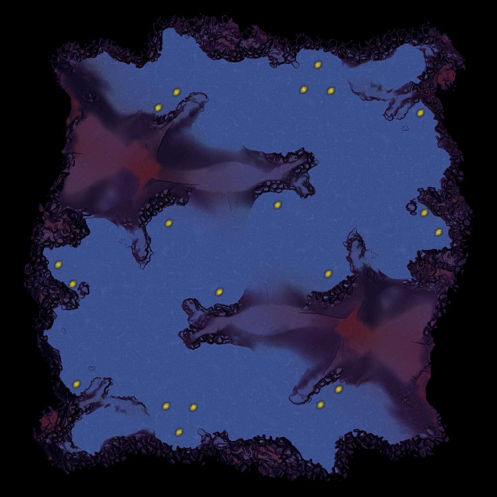
Zed 1.7

By The_Yak
Rating:

1vs1 lavamap
Size: 12 x 12

PLAY ON THIS MAP


Downloads: 566
Manual downloads:
http://springfiles.zebar.de/maps/zed_1.7.sd7
http://spring1.admin-box.com/maps/zed_1.7.sd7
http://api.springfiles.com/files/maps/zed_1.7.sd7


Preview
Filter:    Player:  
sort


9 years ago
Shader trees are go, made lavatex a bit darker too

+8 / -0
The trees look kind of strange on my computer. I have an ATI card.

http://postimg.org/image/ycv9nejf9/
+1 / -0


9 years ago
You have /luashaders disabled. Also you appear to have /advmapshading off.
+0 / -0
9 years ago
/advmapshading is off by default under ultra setting from the lobby. However even with both setting on the map looks the same.
+0 / -0

9 years ago
Some cards just won't run Lua shaders.

It looks like the backup rendering mode when lacking shaders has alpha set to ~1, perhaps lowering alpha to something low (dunno, 0.2-0.3?) in it would make them look better (located [url=[url=https://github.com/sprunk/stuff/blob/master/we_require_more_minerals/minerals.lua#L137]here[/url] in the original code).
+0 / -0
9 years ago
I have a Radeon HD 6970
+0 / -0


9 years ago
Post infolog? you should be able to turn on these features with your card.
+0 / -0
9 years ago
http://pastebin.com/FkkVPeMx
+0 / -0
9 years ago
Ok I fixed it had to reinstall zero-k
+0 / -0


9 years ago
The lava is much too dark. I had trouble playing on it because the terrain is hard to see. LOS is hard to judge as is elevation.
+0 / -0


9 years ago
"LOS is hard to judge" can you elaborate? I don't understand this.
+0 / -0


9 years ago

What can I see? Where can I move? The lowlands terrain is inscrutable.
+2 / -0
Skasi
Most sexy map ever.

Random idea: Add two more geos to NW/SE corners. Interesting heightmap there.
Random idea: Maybe add a metal spot or two to low ground or the mid-low-level height ground near the center. Just a thought.
Or don't do either of these, the map is already interesting. Whichever you want. :)

AUrankAdminGoogleFrog, that's because your fog of war is too dark. Yes the colors are not perfect for visibility, but they're not that bad. I agree though that ramps could be slightly more visible and different from cliffs.
+1 / -0


9 years ago
Yeah fog of war should be just dark enough to be able to clearly diffentiate between what's in los and what's not.

I use fog of war brightness 0.6, looks like ZK default is 0.4.
+0 / -0


9 years ago
THIS MAP IS SO GORGEOUS
+0 / -0

9 years ago
Holy ridiculous, batman. I don't think I can keep up with this kind of nonsense. :) Everything about this map is amazing, gameplay characteristics included.
+0 / -0
8 years ago
Hmm since there is a new version, perhaps this should be removed from 1v1 rotation.
+0 / -0

8 years ago
I think the diffuse has very obvious repetitive patterns. We talked about this :p
+0 / -0
Back to List