Difference between revisions of "Interface"
Jump to navigation
Jump to search
m (Reverted edits by KingRaptorBot (talk) to last revision by KingRaptor) |
m (Added new lines before navbox) |
||
| Line 26: | Line 26: | ||
| 10 || This is the main playing area. Here you see a construction queue made with "shift". | | 10 || This is the main playing area. Here you see a construction queue made with "shift". | ||
|} | |} | ||
| + | |||
| + | |||
{{Navbox manual}} | {{Navbox manual}} | ||
Revision as of 19:05, 6 October 2016
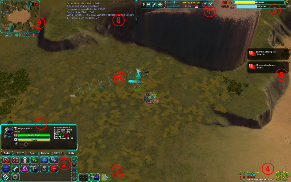
The Zero-K interface is simply structured. See the image below and the related text to understand the basic interface view.

| Number | Explanation |
|---|---|
| 1 | Info Panel. Shows information about the selected unit (like health, build power etc). |
| 2 | Orders Panel. Includes Attack, Move, Fight, etc. This panel has 5 extra tabs for constructors, allowing you to build factories, Economic structures, Defenses, etc |
| 3 | Idle Constructors, Commander, and your factories production queue. If some of your constructors are idle the "M" will turn to yellow. |
| 4 | Player List. An overview of all participants in the game, also spectators. CPU load, Ping and alliance state are shown. |
| 5 | Message including chat and notification. |
| 6 | The resource bars show the metal/energy you have in storage, as well as your income and expenditure. |
| 7 | Menu. Open/Close it with "Esc". It allows you quit, change settings and move the interface. |
| 8 | Chat Log. Gives a history of notifications and chat. |
| 9 | Minimap. Units in combat will glow yellow, dying units red. You can issue orders here just as on the main screen. The buttons allow you to change the view (metal view, height view, etc). |
| 10 | This is the main playing area. Here you see a construction queue made with "shift". |
| The images and links on this page may be broken at the moment. The cache on this page points to the test wiki.
Please purge the cache to try to restore images and fix those links. This will work only if the page is not on the test server (where this box should appear for now even when cache purging is not needed), which may lack the actual images. This page thinks that it resides on test.zero-k.info right now. |